The site has seen a number of transitions since we launched back in May.
First Design
When we launched it was just a quick listing on my private domain.

Rename and a style
When people started using the site a lot, I added more functionality and gave it an overhaul.

Resource Site
A name is born, the site moves from just showing Data Recorders and Contracts to being a fully fledged database site.
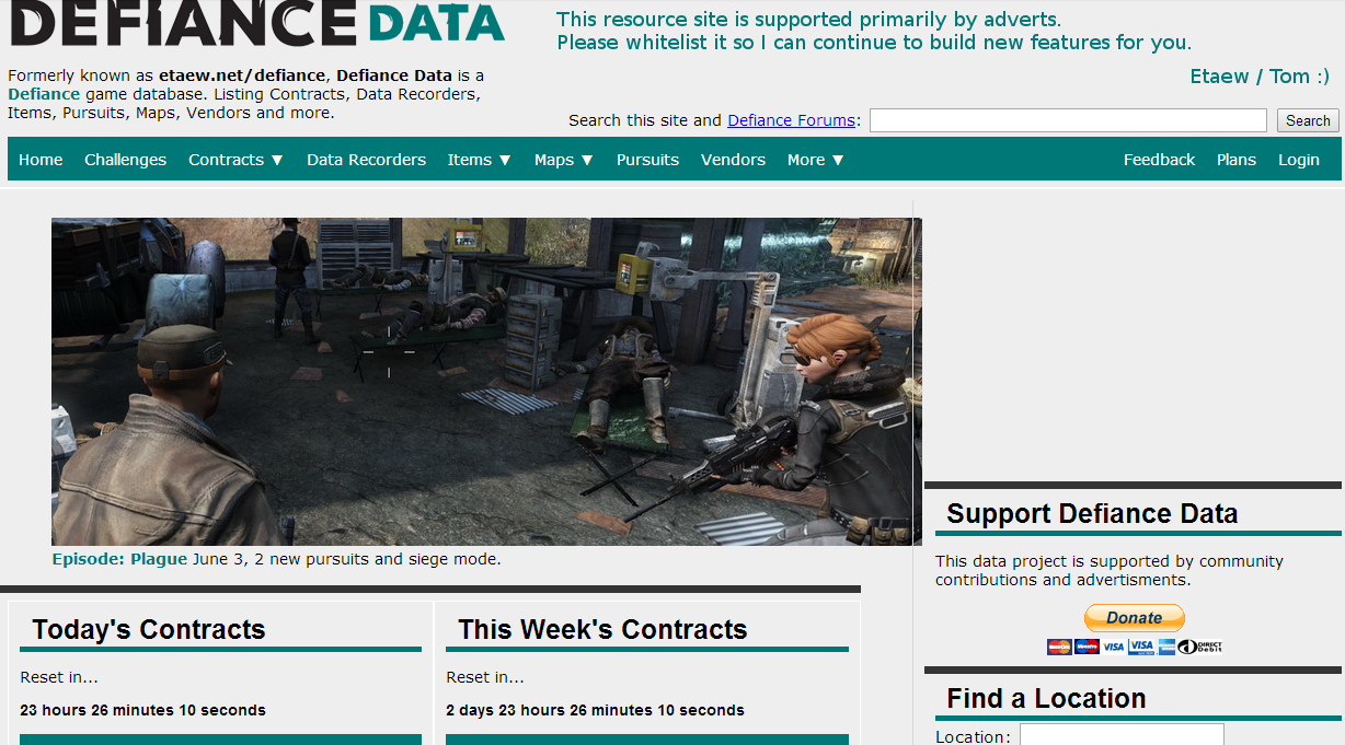
Attempting to Provide Quick Links
This basic style did not last very long.
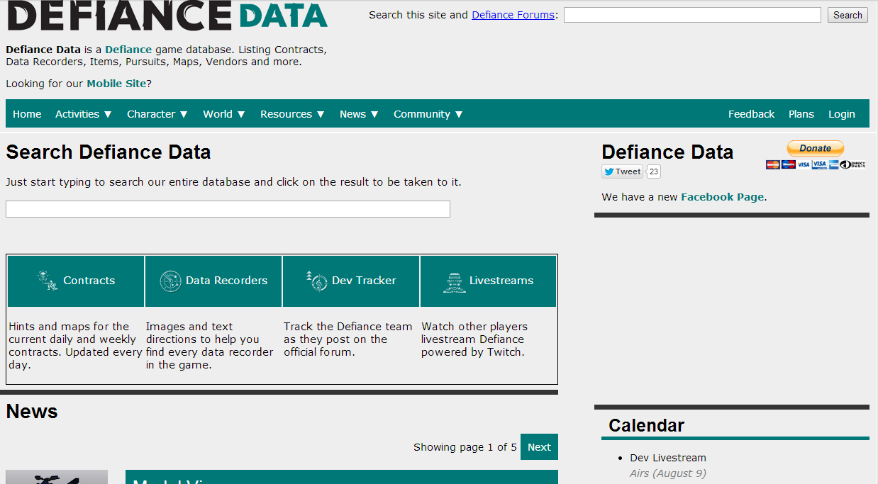
Image Previews
From the colourful design I've tried to keep the design consistant, we got a new logo and cleaned up the font used. Feels much cleaner, image buttons on the right.
Wiki Format - DLC Focus
In this design I've pushed news down to a smaller section and focused on the DLCs and finding data from the home page.
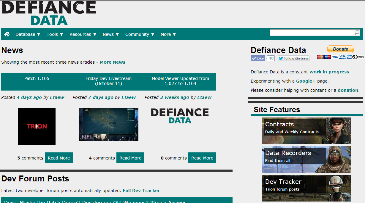
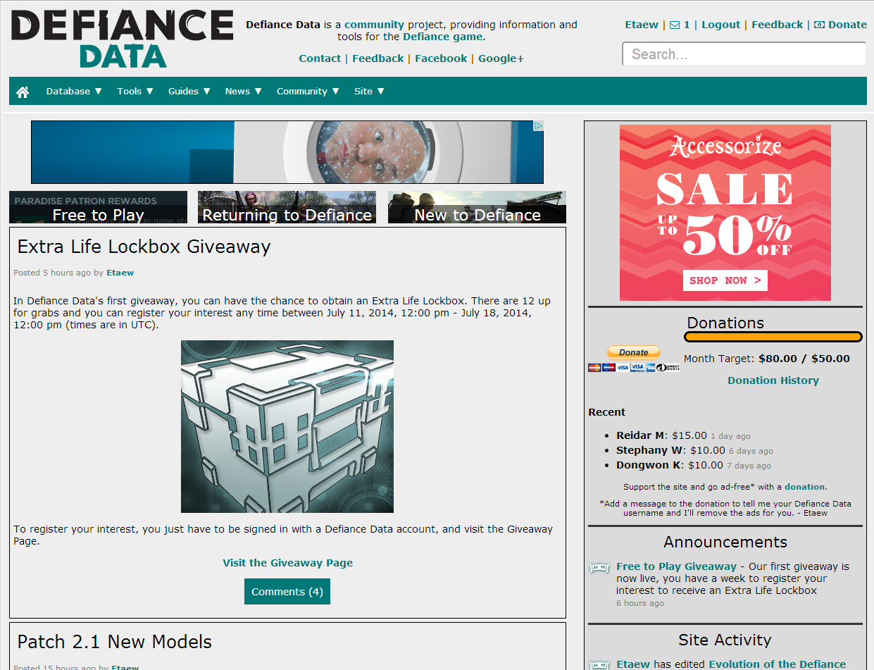
Refined Wiki - News Comeback
The below design brought back the news to the center stage, and still had visual DLC sections below it.
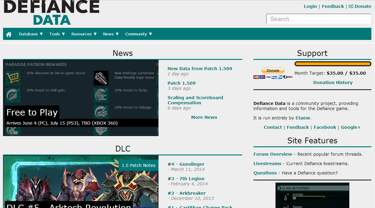
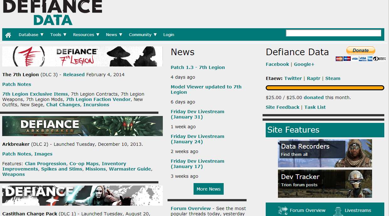
Banners and News
Banners have moved around, buttons at top for quick access, news focus primary, side bar contains lots of stuff, menu main navigation.
Comments
Contribute to the discussion or help improve an article by leaving a comment below.
Sign In to post a comment.
No comments posted here yet.
![]() Stratotech Defiance 2050 [Source]
Stratotech Defiance 2050 [Source]
3PL9 WDFG DKPR 9LE7 P7Y7 [Redeem]